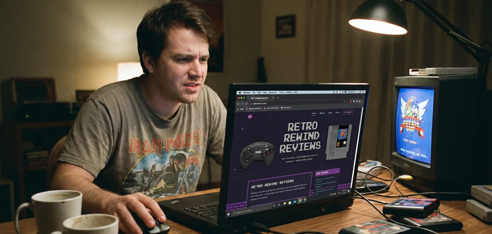
The build was fun. I added gallery sections for games, old-school logos, and even a high-score table. It felt like crafting a digital museum.
What surprised me? It all just worked. Drag and drop elements, mobile responsive templates, and even the custom icons looked sharp on my phone.
But then came JavaScript...

If you're on the fence, just start. You’ll learn along the way, and the tools today are built for beginners
🧩 Where I Got Stuck
I wanted a section where users could sort games by year or console. But I barely know JS, and even copy paste snippets wouldn't work right.
I broke my gallery three times trying to add sorting buttons. I finally gave up and listed everything manually just to get the site live.
Then came the domain issue. I bought a domain, but I couldn't get the https padlock to appear. Later I realized you need SSL certificates, hosting configuration, and a bit of DNS knowledge.
📌 What I'd Tell Other Retro Nerds
- Use simple tools first. Don't jump into JS unless you enjoy trial and error.
- Choose templates that match your vibe. My neon on black layout made the whole site feel more authentic.
- Buy your domain early. It saves time and reduces mistakes later.
- Just start. I waited way too long thinking it had to be perfect.
🧠 What I Learned About Website Builders
Before building my first website, I thought website builders were only for businesses or designers. Turns out, they are perfect for beginners who want something clean without coding.
The template system helped me understand layout, hierarchy, spacing, and typography. Seeing everything update in real time taught me more than any tutorial.
AI tools also helped with structure. It suggested better headlines, improved readability, and even offered SEO keywords that helped make my pages easier to understand.
📱 Mobile Matters More Than I Expected
I built everything on desktop first, and only later checked my site on my phone. Half my layout broke. Buttons were too big, images were cut off, and the gallery spacing was a mess.
Once I used the mobile preview in the builder, it became clear how important responsive design is. A site that looks great on desktop might feel terrible on mobile if the builder settings aren’t tuned correctly.
🔧 The SEO Things No One Tells Beginners
I always thought SEO was magic or some expert only skill, but it’s actually simple once you get the basics.
- Use clear headings so Google understands your sections.
- Write simple sentences. Complicated text confused both readers and search engines.
- Add alt text to your images so they can appear in image search.
- Link between your own pages so Google sees your site as one connected unit.
Once I updated these items, my site actually started appearing for small keywords like retro game collection or beginner website examples.
🧩 What I’d Do Differently Next Time
I would choose the platform first. I jumped around between three builders before committing, and it wasted time. A simple checklist helped: price, templates, features, and support.
I’d also plan my pages before building. A homepage, about page, gallery, and contact form were enough. I overbuilt at the start.
Next time I’d write all my text in advance. Editing inside the builder distracted me.
🕹 Final Thoughts
I thought building a site would be torture. But honestly, it was great. Modern builders are fast, clean, and made for people who don’t code full time.
I might learn JS one day. Or I might hire someone to finish the interactive parts so I can keep writing game reviews. Either way, this project made me realize building a beginner website isn’t scary anymore.
If you're on the fence, just start. You’ll learn along the way, and the tools today are built for beginners.
Want to see how another beginner built their first website from scratch? Check out this real beginner story.